Wednesday, 29 July 2009
Monday, 8 June 2009
Wednesday, 20 May 2009
Final Review Images


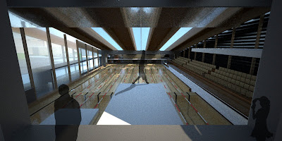
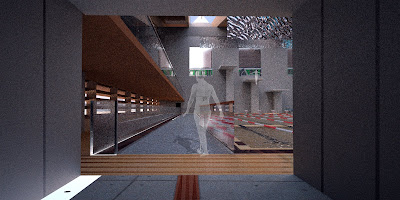
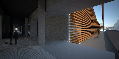
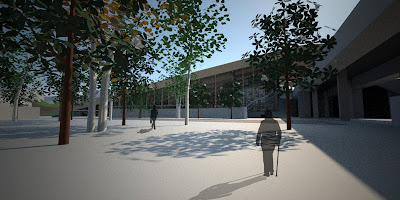
For the final review I presented a rough draft of the final layout. There were some mixed feelings about the style of presentation but overall the design of the building seemed to go down pretty well. Just need to tidy up some areas and create an order to my ideas. Think writing a script might help that for the exam.
Thursday, 7 May 2009
Wednesday, 22 April 2009
Some sketches in progress


Friday, 17 April 2009
Forest Growth
Timber Swimming Pool
Tuesday, 31 March 2009
Friday, 13 March 2009
Wednesday, 11 March 2009
Review comments
Before my review I knew I was not happy with the way the forms were turning out at the moment and this was also brought up by Michael Stacey and Steve Platt. They did however understand that the form was not decided and the renders merely represented the aural spaces I have designed. They seemed fairly happy with the layout and arrangement of the site, few areas need looking at and resolving in more detail (car park/drop off and retail units). I think I did a fairly good job of explaining the reasoning behind each placement and the journeys I am creating.
The points they brought up were:
- Why are the buildings the shape they are - if it is about the aural experience should the outside visuals tell you about the internal audio experiences? Or is it more like the Jorn Utzon Bagsvaerd church with rational plain exterior and undulating aural interior.
- Working out the structure and how these buildings would be made will help the drawings and also the design of the spaces.
- By 'calming' certain buildings and spaces down, this will help enhance the more interesting architecture. If the Sports played in the dry sports hall do not require anything other than a quiet box then this is what should probably be provided.
- References - Alvar Aalto plans, Utzon Church, Palladio, Sergison Bates.
The main question that still remains is how I am going to present this in the final review. I have plenty of ideas but I just havent had the chance to fully think it through.
Sunday, 8 March 2009
Saturday, 7 March 2009
Doggy Drop-off
Friday, 6 March 2009
Saturday, 28 February 2009
Pool Concept


My initial thoughts for the pool design were very traditional and stuck in the realm of the visual. I decided it was much more to do with the feeling of the spaces, their audio qualities and the textures that guide you than whether it looks like a professional swimming arena.
The main areas I am trying to resolve are:
1. The pool ends - turning points. The visually impaired swimmer needs to be aware of the ends of the pool to turn or to reach for the finish. I want to create a bigger landmark at the end of the pool using architecture to signify and amplify this edge condition. Perhaps through natural lighting or perhaps through a textural sensation (e.g passing through an archway that has a mist of water that falls over the swimmer) and also through the changing of the reverberation of the space.
2. Lane division. Traditional red and white floating lane dividers are very hard and harsh if bumped into and do not provide a comfortable way of separating the pool water. I realise that they also help control the amount of waves and turbulence created by other swimmers so it is not as simple as just replacing them with a soft floating device as this may not work. I want to use the roof to express the lane divisions. I also want to use the roof architecture as the 5m backstroke turning markers.
Through these initial concept renders I have experimented with tapering both the roof and walls in at one end so that the Eastern end of the pool is both darker and smaller and through introducing light and increasing the size of the space, swimmers should be aware of their position in the pool hall. I have also introduced a viewing window from the tram line that passes by and a series of slit windows down the Southern facade that are set at precise intervals to help guide people along the pool edge.
This is far from complete, and I will continue to explore more ways I can use the architecture to help a visually impaired swimmers experience.
Monday, 23 February 2009
Friday, 20 February 2009
Thursday, 12 February 2009
Musical Architecture
Croatian Sea Organ - An interesting idea about using the landscape to create sounds. May be useful in my scheme.
Monday, 9 February 2009
Sunday, 8 February 2009
Tuesday, 3 February 2009
Subscribe to:
Comments (Atom)


